How to Create a Background Slider with HTML, CSS, and JavaScript
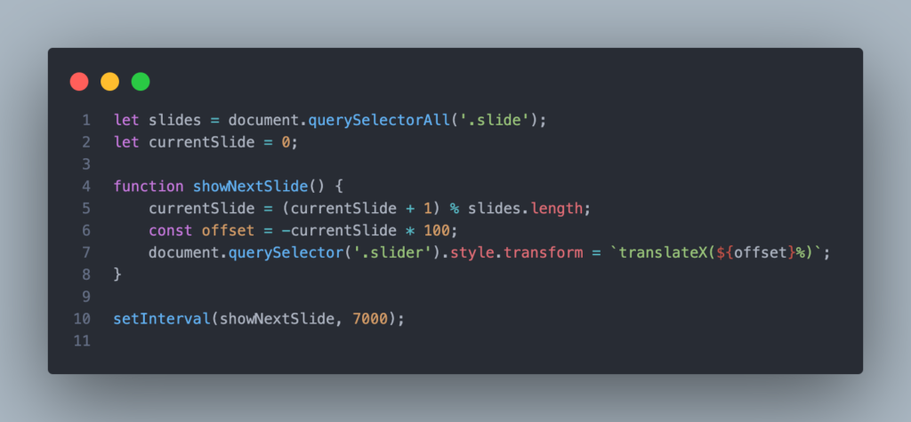
A background slider is a popular web design feature that allows you to display multiple background images that slide from one to the next. This tutorial will guide you through creating a simple yet elegant background slider using HTML, CSS, and JavaScript. Step 1: Setting Up the HTML Structure Start by creating a basic HTML file. We’ll set up a div container for the slider and a div for each slide. Step 2: Styling with CSS Next, we’ll style the slider with CSS to ensure it covers the entire viewport and handles the sliding effect. In this setup: Step 3: Adding the JavaScript Now, we’ll write the JavaScript to handle the sliding effect. The idea is to move the slider by changing its transform property every few seconds. This script: Step 4: Making it Responsive To ensure the slider works well on all devices, including smaller screens, you should add a media query to adjust the layout as needed. This media query ensures that the slider remains responsive, adapting smoothly to different screen sizes. Step 5: Testing and Customizing After implementing the above steps, you should have a fully functional background slider. You can customize the images, transition speed, and other styles to match your design preferences. Final Thoughts Creating a background slider with HTML, CSS, and JavaScript is a great way to add dynamic visual appeal to your website. With a few lines of code, you can create an engaging and interactive experience for your users.
How to Create a Background Slider with HTML, CSS, and JavaScript Read Post »

