A background slider is a popular web design feature that allows you to display multiple background images that slide from one to the next. This tutorial will guide you through creating a simple yet elegant background slider using HTML, CSS, and JavaScript.
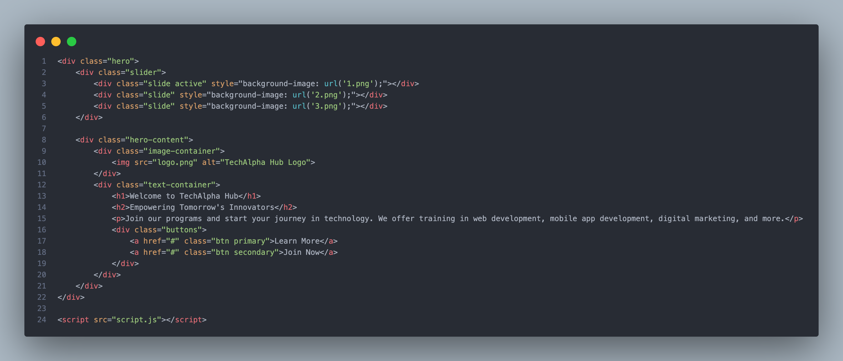
Step 1: Setting Up the HTML Structure
Start by creating a basic HTML file. We’ll set up a div container for the slider and a div for each slide.
<div class="hero">
        <div class="slider">
            <div class="slide active" style="background-image: url('1.png');"></div>
            <div class="slide" style="background-image: url('2.png');"></div>
            <div class="slide" style="background-image: url('3.png');"></div>
        </div>

        <div class="hero-content">
            <div class="image-container">
                <img src="logo.png" alt="TechAlpha Hub Logo">
            </div>
            <div class="text-container">
                <h1>Welcome to TechAlpha Hub</h1>
                <h2>Empowering Tomorrow's Innovators</h2>
                <p>Join our programs and start your journey in technology. We offer training in web development, mobile app development, digital marketing, and more.</p>
                <div class="buttons">
                    <a href="#" class="btn primary">Learn More</a>
                    <a href="#" class="btn secondary">Join Now</a>
                </div>
            </div>
        </div>
    </div>

    <script src="script.js"></script>
Step 2: Styling with CSS
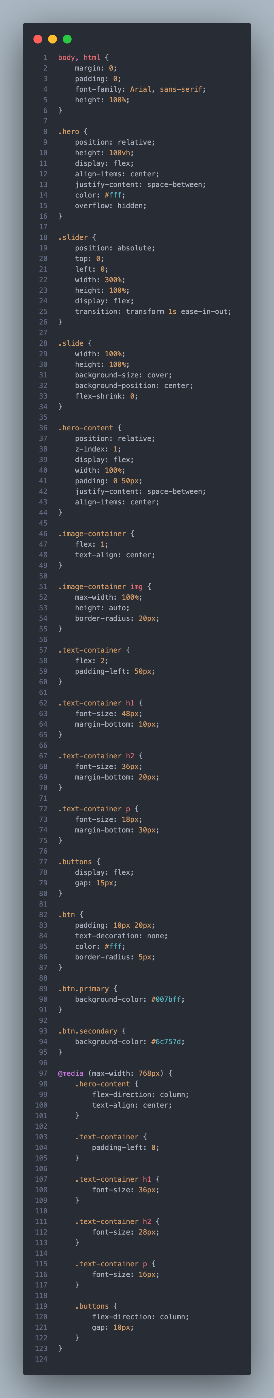
Next, we’ll style the slider with CSS to ensure it covers the entire viewport and handles the sliding effect.
body, html {
    margin: 0;
    padding: 0;
    font-family: Arial, sans-serif;
    height: 100%;
}

.hero {
    position: relative;
    height: 100vh;
    display: flex;
    align-items: center;
    justify-content: space-between;
    color: #fff;
    overflow: hidden;
}

.slider {
    position: absolute;
    top: 0;
    left: 0;
    width: 300%;
    height: 100%;
    display: flex;
    transition: transform 1s ease-in-out;
}

.slide {
    width: 100%;
    height: 100%;
    background-size: cover;
    background-position: center;
    flex-shrink: 0;
}

.hero-content {
    position: relative;
    z-index: 1;
    display: flex;
    width: 100%;
    padding: 0 50px;
    justify-content: space-between;
    align-items: center;
}

.image-container {
    flex: 1;
    text-align: center;
}

.image-container img {
    max-width: 100%;
    height: auto;
    border-radius: 20px;
}

.text-container {
    flex: 2;
    padding-left: 50px;
}

.text-container h1 {
    font-size: 48px;
    margin-bottom: 10px;
}

.text-container h2 {
    font-size: 36px;
    margin-bottom: 20px;
}

.text-container p {
    font-size: 18px;
    margin-bottom: 30px;
}

.buttons {
    display: flex;
    gap: 15px;
}

.btn {
    padding: 10px 20px;
    text-decoration: none;
    color: #fff;
    border-radius: 5px;
}

.btn.primary {
    background-color: #007bff;
}

.btn.secondary {
    background-color: #6c757d;
}

@media (max-width: 768px) {
    .hero-content {
        flex-direction: column;
        text-align: center;
    }

    .text-container {
        padding-left: 0;
    }

    .text-container h1 {
        font-size: 36px;
    }

    .text-container h2 {
        font-size: 28px;
    }

    .text-container p {
        font-size: 16px;
    }

    .buttons {
        flex-direction: column;
        gap: 10px;
    }
}
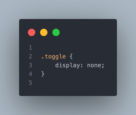
In this setup:
- The
.sliderdiv is set to300%width to fit three slides side by side. - The
transitionproperty on the.sliderdiv ensures a smooth sliding animation. - Each
.slideis styled to cover the full width and height of the viewport, andflex-shrink: 0prevents slides from shrinking when the container resizes.
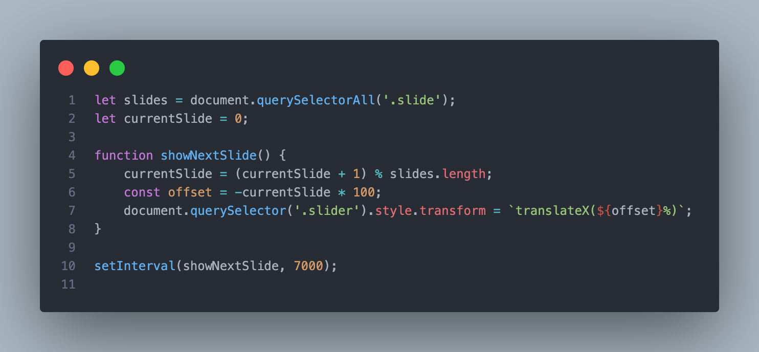
Step 3: Adding the JavaScript
Now, we’ll write the JavaScript to handle the sliding effect. The idea is to move the slider by changing its transform property every few seconds.
let slides = document.querySelectorAll('.slide');
let currentSlide = 0;

function showNextSlide() {
    currentSlide = (currentSlide + 1) % slides.length;
    const offset = -currentSlide * 100;
    document.querySelector('.slider').style.transform = `translateX(${offset}%)`;
}

setInterval(showNextSlide, 7000);
This script:
- Selects all slides and keeps track of the current slide with
currentSlide. - The
showNextSlidefunction calculates the new offset for the slider based on the current slide index and applies it usingtransform: translateX(). setIntervalis used to automatically transition to the next slide every 5 seconds.
Step 4: Making it Responsive
To ensure the slider works well on all devices, including smaller screens, you should add a media query to adjust the layout as needed.
@media (max-width: 768px) {
    .slider {
        width: 300%;
    }
}
This media query ensures that the slider remains responsive, adapting smoothly to different screen sizes.
Step 5: Testing and Customizing
After implementing the above steps, you should have a fully functional background slider. You can customize the images, transition speed, and other styles to match your design preferences.
Final Thoughts
Creating a background slider with HTML, CSS, and JavaScript is a great way to add dynamic visual appeal to your website. With a few lines of code, you can create an engaging and interactive experience for your users.