Creating a responsive navbar is essential for any website, as it ensures your navigation menu looks great on all devices, from desktops to smartphones. In this guide, we’ll walk you through building a simple yet effective responsive navbar with a hamburger menu using only HTML and CSS. No JavaScript required!
Step 1: Set Up the HTML Structure
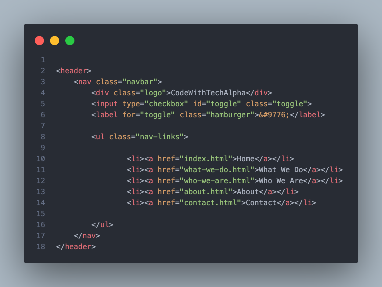
We’ll start by creating the basic HTML structure for our navbar. This includes a logo, a checkbox input (for the hamburger menu functionality), the navigation links, and a label that serves as the hamburger icon.
<header>
    <nav class="navbar">
        <div class="logo">CodeWithTechAlpha</div>
        <input type="checkbox" id="toggle" class="toggle">
        <label for="toggle" class="hamburger">☰</label>

        <ul class="nav-links">

                <li><a href="index.html">Home</a></li>
                <li><a href="what-we-do.html">What We Do</a></li>
                <li><a href="who-we-are.html">Who We Are</a></li>
                <li><a href="about.html">About</a></li>
                <li><a href="contact.html">Contact</a></li>

        </ul>
    </nav>
</header>



Step 2: Style the Navbar with CSS
Next, we’ll style the navbar using CSS. We’ll start by applying general styles, such as font family and resetting default margins and paddings.
* {
    margin: 0;
    padding: 0;
    box-sizing: border-box;
    font-family: 'Trebuchet MS', 'Lucida Sans Unicode', 'Lucida Grande', 'Lucida Sans', Arial, sans-serif;
}

.navbar {
    display: flex;
    justify-content: space-between;
    align-items: center;
    background-color: #181456;
    padding: 30px 50px;
    position: relative;
}

.logo {
    color: white;
    font-size: 1.5em;
    font-weight: bold;
}

.nav-links {
    display: flex;
    list-style: none;
}

.nav-links li {
    margin-left: 20px;
}

.nav-links a {
    color: white;
    text-decoration: none;
    padding: 5px;
}

.nav-links a:hover {
    background-color: #0a296a;
    border-radius: 5px;
}

.hamburger {
    display: none;
    font-size: 2em;
    color: white;
    cursor: pointer;
}

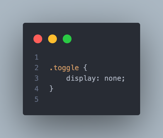
.toggle {
    display: none;
}
Step 3: Make the Navbar Responsive
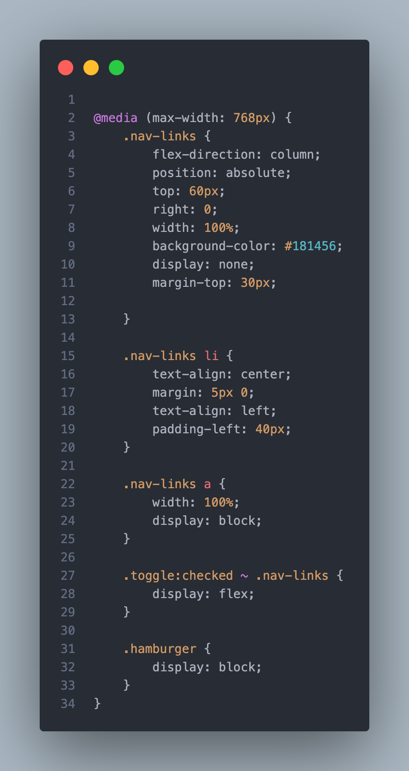
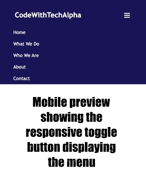
To make the navbar responsive, we’ll use CSS media queries. When the screen width is 768px or less, the navbar will switch to a vertical layout, and the hamburger icon will appear. When the user clicks the hamburger icon, the navigation links will be displayed.
@media (max-width: 768px) {
    .nav-links {
        flex-direction: column;
        position: absolute;
        top: 60px;
        right: 0;
        width: 100%;
        background-color: #181456;
        display: none;
        margin-top: 30px;
    }

    .nav-links li {
        text-align: center;
        margin: 5px 0;
        padding-left: 40px;
    }

    .nav-links a {
        width: 100%;
        display: block;
    }

    .toggle:checked ~ .nav-links {
        display: flex;
    }

    .hamburger {
        display: block;
    }
}
How It Works:
- Hamburger Menu: The
input[type="checkbox"]and its associated label (label[for="toggle"]) serve as the hamburger menu. When checked, it triggers the display of the navigation links. - Responsive Layout: The
@media (max-width: 768px)query is used to switch the layout to a vertical one when the screen width is 768px or less. The.nav-linkscontainer is hidden by default and is displayed only when the checkbox is checked. - CSS Only: This solution uses only HTML and CSS, making it lightweight and easy to integrate into any project.
Final Thoughts
A responsive navbar with a hamburger menu is a must-have for modern websites. This tutorial demonstrates how to create a functional and stylish navbar using just HTML and CSS, ensuring your site is accessible and easy to navigate on all devices.

Impressive!!!