How to Create a Responsive Navbar with a Hamburger Menu Using Only HTML and CSS – No Javascript!
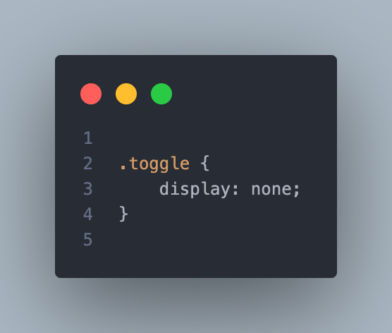
Creating a responsive navbar is essential for any website, as it ensures your navigation menu looks great on all devices, from desktops to smartphones. In this guide, we’ll walk you through building a simple yet effective responsive navbar with a hamburger menu using only HTML and CSS. No JavaScript required! Step 1: Set Up the HTML Structure We’ll start by creating the basic HTML structure for our navbar. This includes a logo, a checkbox input (for the hamburger menu functionality), the navigation links, and a label that serves as the hamburger icon. Step 2: Style the Navbar with CSS Next, we’ll style the navbar using CSS. We’ll start by applying general styles, such as font family and resetting default margins and paddings. Step 3: Make the Navbar Responsive To make the navbar responsive, we’ll use CSS media queries. When the screen width is 768px or less, the navbar will switch to a vertical layout, and the hamburger icon will appear. When the user clicks the hamburger icon, the navigation links will be displayed. How It Works: Final Thoughts A responsive navbar with a hamburger menu is a must-have for modern websites. This tutorial demonstrates how to create a functional and stylish navbar using just HTML and CSS, ensuring your site is accessible and easy to navigate on all devices.
