Responsive Design

Code With TechAlpha, Custom Coded with Nodejs

Special Contact Form with Personalized Thank You Message

Special Contact Form with Personalized Response Built with Node.js TechAlpha Hub introduces a contact form with a unique, personalized user experience. This contact form, built using Node.js, MongoDB, EJS, HTML, and CSS, dynamically greets users by their name after they submit the form, making it more interactive and user-friendly. Whether you’re looking to collect feedback, inquiries, or other information, this form ensures a personal touch for each submission. Visit the live site here: Special Contact FormGitHub Repository: Special Contact Form GitHub Link Key Features of the Contact Form Developed by TechAlpha Hub This contact form is another innovative tool from TechAlpha Hub, designed to make interactions with users more personal and engaging. Whether you’re a business or an organization, this special form ensures that every user feels acknowledged. Try out the live demo here: Special Contact Form. Conclusion TechAlpha Hub’s contact form stands out by delivering a personalized thank-you message to users after submission. Built with Node.js, MongoDB, and EJS, it combines functionality with a personal touch, making it an excellent tool for any website or application. To explore the code behind this app, visit the GitHub repository: Special Contact Form GitHub Link.

Special Contact Form with Personalized Thank You Message Read Post »

Code With TechAlpha, Custom Coded with Nodejs, Uncategorized

Weather App Built with Node.js and MongoDB

TechAlpha Hub has developed an intuitive weather app that provides real-time weather updates for any location, delivering precise and detailed weather data. Built using Node.js, MongoDB, EJS, HTML, and CSS, this weather app offers users an easy way to check local conditions like temperature, humidity, wind speed, and cloud cover. Whether you need to check the weather in your city or plan ahead for a trip, this app has you covered. Visit the live site here: TechAlpha Weather AppGitHub Repository: WeatherApp GitHub Link Key Features of the Weather App Developed by TechAlpha Hub This weather app is another innovative project by TechAlpha Hub, designed to offer users a reliable and user-friendly way to get real-time weather forecasts. The app is perfect for anyone who needs to stay updated on weather conditions and plan accordingly. Explore the app and see real-time forecasts here: TechAlpha Weather App. Conclusion TechAlpha Hub’s weather app provides accurate and detailed weather data in real-time, making it an essential tool for anyone needing fast, reliable forecasts. Built with Node.js, MongoDB, and EJS, it demonstrates the perfect blend of functionality and design. For more details on the code behind this app, visit the GitHub repository: WeatherApp GitHub Link.

Weather App Built with Node.js and MongoDB Read Post »

Custom Coded with Nodejs

Professional Modern Blog App with Weather Features

Modern Blog App with Weather Feature Built with Node.js and MongoDB TechAlpha Hub continues to innovate with their latest creation: a blog app that not only allows users to publish and manage posts but also includes a unique integrated weather feature. This modern blog app, built using Node.js, MongoDB, EJS, HTML, and CSS, combines blogging with real-time weather updates, offering users an engaging and informative experience. Visit the live site here: TechAlpha Blog AppGitHub Repository: BlogApp GitHub Link Key Features of the Blog App Built by TechAlpha Hub The TechAlpha Hub team is known for developing cutting-edge web applications, and this blog app is no exception. By combining powerful technologies like Node.js and MongoDB, they’ve created a robust platform that caters to both bloggers and readers, with the added bonus of real-time weather updates. Explore the live demo of the app here: TechAlpha Blog App. Conclusion The TechAlpha Blog App is a modern and versatile platform that makes it easy for users to manage blog posts while staying updated with real-time weather information. Built with Node.js, MongoDB, and EJS, this app showcases the technical expertise of the TechAlpha Hub team. For a closer look at the code behind this project, check out the GitHub repository: BlogApp GitHub Link.

Professional Modern Blog App with Weather Features Read Post »

Code With TechAlpha

How to Create a Background Slider with HTML, CSS, and JavaScript

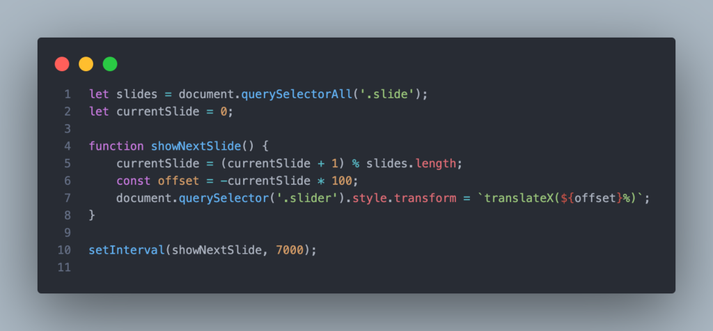
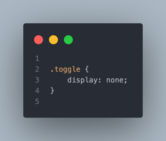
A background slider is a popular web design feature that allows you to display multiple background images that slide from one to the next. This tutorial will guide you through creating a simple yet elegant background slider using HTML, CSS, and JavaScript. Step 1: Setting Up the HTML Structure Start by creating a basic HTML file. We’ll set up a div container for the slider and a div for each slide. Step 2: Styling with CSS Next, we’ll style the slider with CSS to ensure it covers the entire viewport and handles the sliding effect. In this setup: Step 3: Adding the JavaScript Now, we’ll write the JavaScript to handle the sliding effect. The idea is to move the slider by changing its transform property every few seconds. This script: Step 4: Making it Responsive To ensure the slider works well on all devices, including smaller screens, you should add a media query to adjust the layout as needed. This media query ensures that the slider remains responsive, adapting smoothly to different screen sizes. Step 5: Testing and Customizing After implementing the above steps, you should have a fully functional background slider. You can customize the images, transition speed, and other styles to match your design preferences. Final Thoughts Creating a background slider with HTML, CSS, and JavaScript is a great way to add dynamic visual appeal to your website. With a few lines of code, you can create an engaging and interactive experience for your users.

How to Create a Background Slider with HTML, CSS, and JavaScript Read Post »

Code With TechAlpha

How to Create a Responsive Navbar with a Hamburger Menu Using Only HTML and CSS – No Javascript!

Creating a responsive navbar is essential for any website, as it ensures your navigation menu looks great on all devices, from desktops to smartphones. In this guide, we’ll walk you through building a simple yet effective responsive navbar with a hamburger menu using only HTML and CSS. No JavaScript required! Step 1: Set Up the HTML Structure We’ll start by creating the basic HTML structure for our navbar. This includes a logo, a checkbox input (for the hamburger menu functionality), the navigation links, and a label that serves as the hamburger icon. Step 2: Style the Navbar with CSS Next, we’ll style the navbar using CSS. We’ll start by applying general styles, such as font family and resetting default margins and paddings. Step 3: Make the Navbar Responsive To make the navbar responsive, we’ll use CSS media queries. When the screen width is 768px or less, the navbar will switch to a vertical layout, and the hamburger icon will appear. When the user clicks the hamburger icon, the navigation links will be displayed. How It Works: Final Thoughts A responsive navbar with a hamburger menu is a must-have for modern websites. This tutorial demonstrates how to create a functional and stylish navbar using just HTML and CSS, ensuring your site is accessible and easy to navigate on all devices.

How to Create a Responsive Navbar with a Hamburger Menu Using Only HTML and CSS – No Javascript! Read Post »

Scroll to Top